
Every team has sat through the same painful meeting. Someone lists a dozen ideas on a whiteboard, everyone talks over each other about which matters most, and 40 minutes later you leave with a list nobody agrees on. The problem isn't your team — it's the format. A flat list forces you to compare everything against everything at once. A 2×2 grid fixes that by asking one simple question at a time, and EngageSlide lets your whole audience answer it together, live.
The 2×2 grid (also called a prioritization matrix) is one of EngageSlide's interactive question slides. Instead of voting for a single option, each person plots every idea onto a two-axis chart — usually impact against effort — and the results average into one clear map of what to do first. In this guide you'll learn what the grid is, why it works, and exactly how to run one with a live audience.
What is a 2×2 grid?
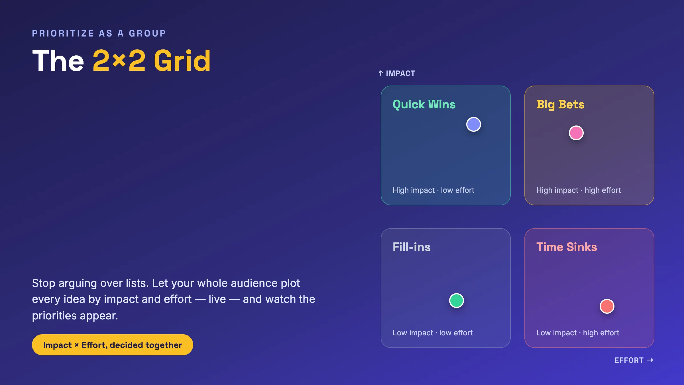
A 2×2 grid divides a space into four quadrants using two axes you define. The classic setup plots how much impact an idea will have (vertical) against how much effort it takes (horizontal), which sorts everything into four instantly useful buckets:
- Quick Wins — high impact, low effort. Do these now.
- Big Bets — high impact, high effort. Plan and resource these deliberately.
- Fill-ins — low impact, low effort. Nice-to-haves for spare time.
- Time Sinks — low impact, high effort. Politely say no.
The power of the grid is that it turns a vague argument ("this feels important") into a concrete position on a map. And you don't have to use impact and effort — the same slide works for cost vs. value, urgency vs. importance (the classic Eisenhower approach), or reach vs. confidence. You simply rename the two axes.
Why plotting live beats a whiteboard
You could draw a 2×2 on a whiteboard, but a live grid solves the two things that always go wrong in a room. First, the loudest voice wins a verbal debate; on a live grid, every person places their own dots privately, so a quiet expert counts exactly as much as the most senior person present. Second, a whiteboard captures one person's opinion; EngageSlide averages everyone's placements into a single position per idea, so you see genuine group consensus — and the spread that reveals where you actually disagree.
This makes the grid a natural companion to other group-decision tools. Where a ranking or rating poll tells you the order of preferences, a 2×2 tells you the reasoning behind them — two dimensions at once, not just a single line. It's the difference between "we like this most" and "we like this because it's high impact and cheap to build."
What a live grid looks like
Here's a real EngageSlide 2×2 in action. A team asked "Where should these features land?" and everyone plotted five candidate features by impact and effort from their phones. The averaged result maps the roadmap at a glance — dark mode and faster search sit in Quick Wins, a mobile app is a Big Bet, a new logo is a low-priority fill-in, and a legacy rewrite is a clear time sink.
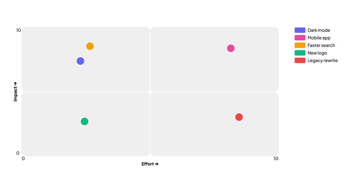
Notice how much a single picture communicates. Nobody has to summarize the discussion because the discussion is the picture. The room can immediately point at the top-left corner and agree, "let's start there" — which is the whole reason you ran the exercise.
A prioritization matrix works because it never asks people to rank everything at once. It only ever asks two easy questions — how big, and how hard — and lets the four quadrants do the deciding.
How to run a 2×2 grid in EngageSlide
The slide is quick to set up and even quicker to run:
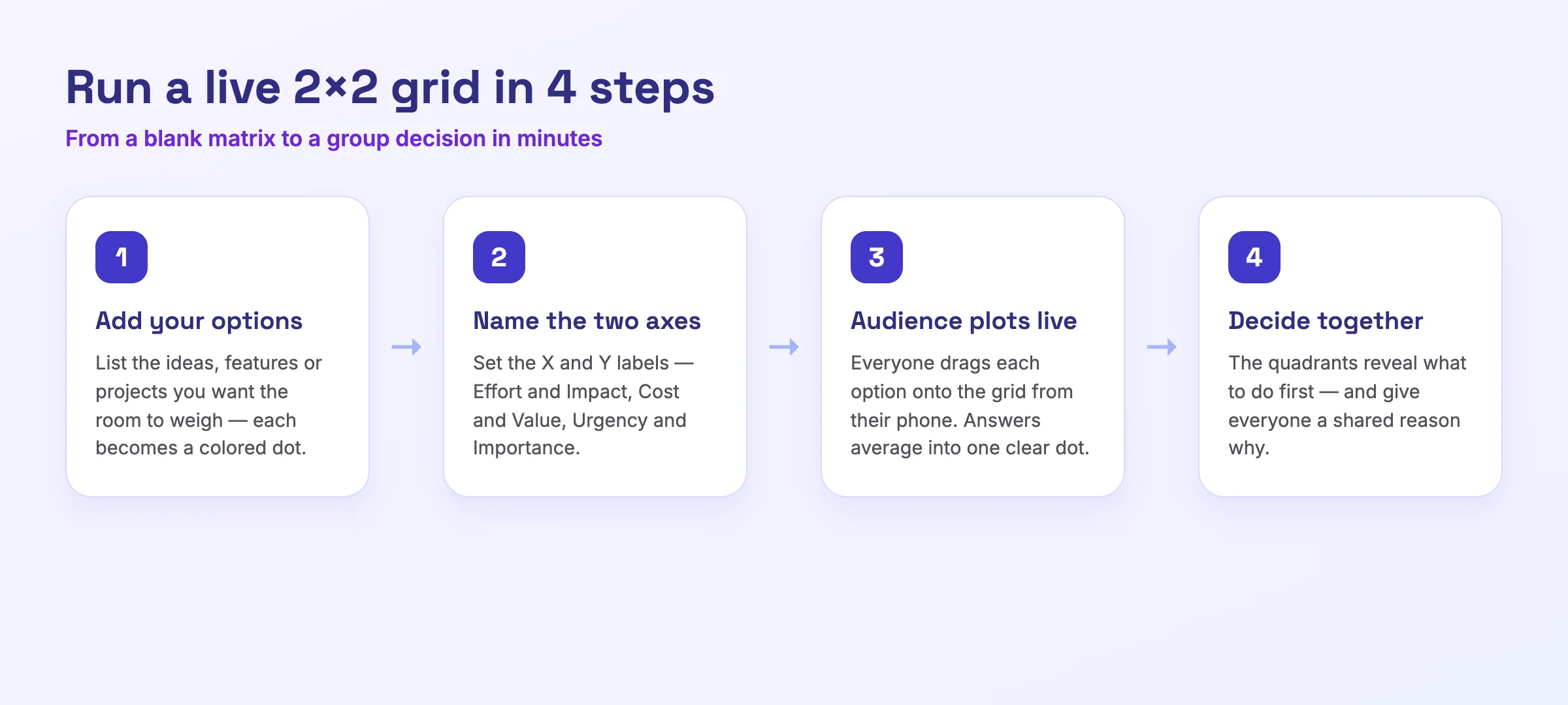
- Add your options. In the editor, add a 2×2 Grid slide and list the ideas, features, or projects you want the room to weigh. Each option becomes a colored dot on the chart.
- Name the two axes. Open the grid settings and label your X axis and Y axis — for example "Effort ➔" and "Impact ➔" — and set the minimum and maximum values for the scale.
- Let the audience plot live. Present the slide and share the join code. Each participant places every option onto the grid from their own device, and the answers average into one dot per idea.
- Decide together. Read the quadrants as a group, agree on what to tackle first, and move on — with a shared, visible reason behind every decision.
A few habits make the results far sharper. Keep the number of options to roughly five to eight — more than that and the grid turns into a cloud of dots nobody can read. Define what each axis actually means before people vote ("effort" measured in engineering weeks, not gut feel), so everyone is plotting against the same yardstick. And when two dots land almost on top of each other, don't rush past it — tied positions are exactly where the most useful conversation happens, because they force the room to name the tie-breaker that really matters.
Where a 2×2 grid earns its keep
The format is deceptively versatile. Reach for it whenever a group needs to choose what to do rather than simply share an opinion:
- Product and roadmap planning. Prioritize features or bugs by impact vs. effort so the team ships the highest-leverage work first.
- Workshops and retrospectives. Sort improvement ideas by value vs. difficulty to decide which changes to actually commit to.
- Strategy offsites. Map initiatives by urgency vs. importance to separate the truly critical from the merely loud.
- Classrooms. Have students plot historical events, scientific factors, or risk scenarios along two dimensions to spark discussion — the placement matters less than the debate it starts.
Like any live activity, a 2×2 works best when it's part of a flow rather than a one-off. A great sequence is to open with a quick poll or icebreaker to get everyone participating, run the grid to make the real decision, and close by capturing next steps. Good prioritization isn't about having more opinions in the room — it's about turning the opinions you already have into a decision everyone can see and support.
The next time a planning meeting threatens to become a debate about a list, don't reach for the whiteboard. Add a 2×2 grid, let the whole room plot at once, and watch the priorities sort themselves out. Discover more ways to make meetings decisive with an interactive presentation tool, or browse the EngageSlide blog for more live-engagement ideas.