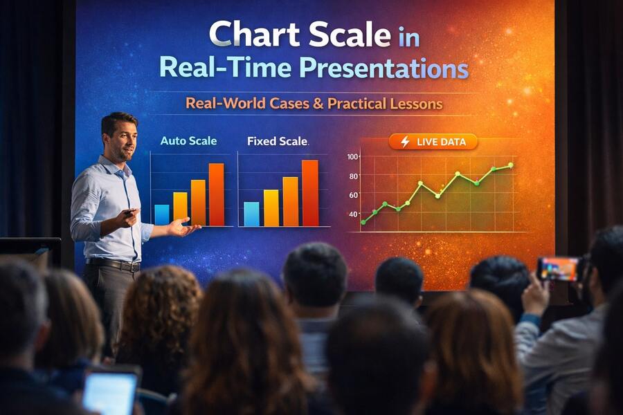
In modern interactive presentations, especially those powered by real-time audience input, most attention goes to questions, visuals, or engagement mechanics. Yet one of the most influential factors shaping how data is interpreted often goes unnoticed: chart scale.
Chart scale does not change the data itself, but it profoundly affects how people perceive that data. In real-time environments, where charts update live as participants respond, poor scale choices can distort insights, exaggerate differences, or lead to premature conclusions.
This article explores real-world cases of applying chart scale in real-time presentations—what went wrong, what worked, and what lessons presenters can apply immediately.
Case 1: Internal Live Poll — Auto Scale Creates a False Sense of Consensus
Context
During an internal product meeting with about 40 participants, the presenter asked:
“Do you agree with the proposed product direction?”
Real-time results:
Agree: 24 votes
Disagree: 16 votes
The results were displayed using auto scale.
What happened
Because the chart’s Y-axis automatically scaled to the highest value (24), the “Agree” bar appeared significantly taller, visually dominating the chart.
The problem
While the visual suggested strong consensus, the reality was very different:
40% of participants disagreed
This represented a meaningful internal concern
Auto scaling amplified a modest difference, making it appear decisive.
Lesson learned
Auto scale is effective for sparking discussion, but dangerous for decision-making polls.
For questions that influence strategy or direction, presenters should prefer:
Fixed scale
Percentage-based axes
Or clearly labeled reference points
Case 2: Training Evaluation — Fixed Scale Enables Honest Comparison
Context
A training program ran across three sessions. At the end of each session, participants rated their understanding on a 1–5 scale.
Initial approach
Each session used auto-scaled charts based on that session’s responses.
What happened
Visually, all three charts looked “very positive,” but the underlying averages told a subtler story:
Session 1: 3.8
Session 2: 4.1
Session 3: 4.0
Auto scaling minimized visible differences, making trends difficult to spot.
Correction
The team switched to a fixed 1–5 scale across all sessions.
Outcome
Performance trends became immediately visible
Trainers could identify which sessions were most effective
Data could be trusted for long-term improvement
Lesson learned
For ratings, surveys, and repeated measurements, fixed scale is not optional—it is essential, even in real-time contexts.
Case 3: Workshop Kickoff — Auto Scale Encourages Participation
Context
At the beginning of a workshop, participants were asked:
“Which area is currently your biggest challenge?”
Multiple answers were allowed, and results updated live.
Scale choice
Auto scale was deliberately enabled.
What happened
Each new vote caused noticeable chart movement
Participants immediately saw the impact of their input
Engagement increased as people tried to “push” their option higher
Outcome
High participation rate
Energetic discussion
Clear signals for the facilitator to steer the session
Lesson learned
Auto scale is highly effective when the goal is engagement and momentum, not precision or comparison.
Used intentionally, it enhances the emotional feedback loop of real-time interaction.
Case 4: Business Review — Stable Scale Preserves Trust
Context
A leadership review session collected real-time feedback on:
Process clarity
Strategic alignment
Team confidence
Key requirement
The data needed to be:
Credible
Non-manipulative
Suitable for serious discussion
Scale strategy
Fixed scale (0–10)
Consistent axis throughout the session
What happened
Charts updated in real time without dramatic visual shifts
Participants focused on meaning, not visual shock
Discussions centered on why scores were low or high, not whether the chart was misleading
Lesson learned
Real-time does not mean dynamic scale.
In business environments, stability builds trust, and trust is more important than visual excitement.
Case 5: Comparing Across Events — Scale as a Prerequisite for Insight
Context
An organization ran the same poll across multiple events and wanted to compare outcomes.
Common mistake
Each session used auto scale
Charts looked dramatically different despite similar underlying data
Result
Stakeholders debated visuals instead of insights
Comparisons were unreliable
Correct approach
Define a fixed scale before the first session
Apply it consistently across all presentations
Outcome
Meaningful cross-event comparisons
Cleaner reporting
Fewer subjective arguments
Lesson learned
If you plan to compare results across time or sessions, scale consistency is non-negotiable.
Key Takeaways: Choosing the Right Scale for the Right Goal
Chart scale is not a technical detail—it is a design decision with cognitive consequences.
Use auto scale when:
The goal is engagement
The poll is exploratory
You want to emphasize movement and participation
Use fixed scale when:
Results influence decisions
Data will be compared over time
You need credibility and fairness
In real-time presentation platforms like EngageSlide, giving presenters control over chart scale is not just a feature—it is a safeguard against misinterpretation.
Conclusion
Great real-time presentations do not rely on flashy visuals alone. They depend on clarity, honesty, and context.
Chart scale defines the lens through which audiences interpret live data. When chosen intentionally, it supports better discussion, better decisions, and better outcomes. When ignored, it quietly undermines trust.
The most effective presenters treat chart scale not as a default setting, but as a strategic choice—one that aligns visual behavior with the true purpose of the presentation.
