

"I think it went well" is how most presentations get evaluated. The room laughed at the right moment, nobody walked out, a few people said "great talk" on the way to coffee. None of that tells you whether the session actually worked, and none of it helps you make the next one better. The fix is not a 40-question evaluation form. It is a small set of presentation metrics, chosen before you present, captured while you present, and checked the same day. This guide gives you that framework, the seven numbers worth tracking, and how to collect each one in EngageSlide without adding work to your session.
Why "It Went Well" Is Not a Metric
Gut feel is biased toward the loudest people in the room. The three enthusiastic front-row participants shape your memory of the session, while the 60 people who quietly checked email do not. Applause and attendance measure politeness and scheduling, not attention or understanding.
Good presentation metrics share three traits:
- They are tied to a goal. A training session, a sales pitch and an all-hands have different jobs, so they need different numbers.
- They come from behaviour, not opinion alone. What people did (answered, asked, scored) is more reliable than what they say they felt.
- They are comparable. A number is only useful next to a baseline: last month's session, the same talk to a different team, or your own target.
The Framework: Before, During and After
Split measurement into three phases. Each phase answers a different question, and skipping one leaves a blind spot.
Before: define success and set a baseline
Write one sentence: "This session succeeds if ___." For a training it might be "80% of attendees can answer the three core compliance questions correctly." For a product demo it might be "at least 20 people ask to see pricing." Then pick the two or three metrics from the list below that prove it. A quick opening poll ("How confident are you with this topic, 1 to 5?") doubles as a baseline you can compare against at the end.
During: measure behaviour in real time
This is where interactive slides earn their keep. Every poll vote, quiz answer, word cloud entry and Q&A question is a data point you would never get from a slide deck alone. You do not have to watch the numbers while presenting; they are stored automatically for the report.
After: measure outcomes and satisfaction
Right after the session, ask for a short rating and one open comment, then check your report within 24 hours while the session is still fresh in your mind. Outcome metrics (quiz accuracy, follow-up actions) tell you whether the goal was met; satisfaction metrics tell you how it felt to the audience.
The 7 Presentation Metrics Worth Tracking
You do not need all seven every time. Pick the ones that match your goal, and track them consistently.
- Participation rate. Participants who joined the interactive session divided by the number of people in the room or on the call. EngageSlide's report shows Total Participants; compare it with your attendance list. Below 60% usually means the join step (QR code or access code) was shown too late or too briefly.
- Response rate per slide. Submissions on a slide divided by participants. The report lists submissions for every interactive slide, so you can see exactly where people stopped answering. A sudden dip marks a confusing question or a moment where energy dropped.
- Retention (peak vs. end). Compare Peak Online with how many people were still answering on your last few slides. A long, steady decline is normal in a 60-minute session; a cliff after one specific slide is a content problem.
- Quiz accuracy. The Average Score and per-question results show whether your key points landed. If most people miss the same question, the gap is in how that idea was explained, not in the audience.
- Questions asked and upvotes. The number of Q&A questions, and which ones collected the most upvotes, measure curiosity and reveal what people still want to know. Zero questions in a 200-person session is a signal, not a success.
- Reactions. Likes, hearts, smiles and sad-face reactions are a lightweight pulse. They are noisy on their own, but a spike of reactions on one slide tells you which moment resonated.
- Satisfaction score. An average rating plus the full rating distribution. Look at the distribution, not just the average: a 3.8 made of mostly 4s is very different from a 3.8 made of 5s and 1s.
How to Set Targets That Mean Something
Industry benchmarks for presentations are rare and rarely comparable, because audiences, formats and room sizes vary so much. Your own history is the best benchmark. Record the same metrics for three sessions, then set targets from your median. A realistic first goal is improving one metric by 10 to 15 percent at a time, for example raising response rate on your mid-session quiz from 55% to 65% by moving it earlier.
If you train people for a living, map your metrics to the Kirkpatrick evaluation levels: satisfaction is Level 1 (reaction), quiz accuracy is Level 2 (learning), and follow-up actions point toward Level 3 (behaviour). That framing makes your numbers easy to explain to managers who already use it.
Collect the "After" Metrics With a Linked Survey
The most common gap is the after phase: the session ends, people leave, and the feedback form sent two days later gets a 5% response rate. The fix is to ask while people are still in the room. With the EngageSlide online survey maker you build a short feedback survey, link it to your presentation and turn on "show on last slide", so the audience sees a button to open it on their phones the moment you reach your closing slide.
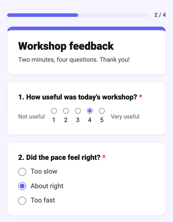
Keep it to three questions so completion stays high:
- A rating question. Use a linear scale from 1 to 5 for satisfaction, or 0 to 10 if you want a Net Promoter Score-style "How likely are you to recommend this session?"
- One open question. "What is one thing you will do differently after today?" measures intent to act, which is closer to real impact than "Did you enjoy it?"
- An optional improvement question. "What should we cut or expand next time?" gives you the qualitative reason behind the numbers.
Responses appear in the survey's Summary view, you can read each person's answers in the Individual view, and a CSV export lets you combine several sessions in a spreadsheet. For a step-by-step setup, see our guide on how to link a survey to your presentation.
Turn the Numbers Into Changes
Metrics only matter if they change the next session. Use simple if/then rules when you read your report:
- Low participation rate: show the join QR code in your first two minutes and leave it on screen during a warm-up poll.
- Response rate drops on one slide: rewrite that question in plain language or cut the number of options.
- Retention cliff after a section: shorten that section or break it up with an interaction every 8 to 10 minutes.
- Low quiz accuracy on one question: re-teach that concept next time with an example, then re-ask the question.
- High satisfaction, low accuracy: the session was enjoyable but did not stick; add a knowledge check before the close.
- Many upvoted questions on the same topic: that topic deserves its own slide, or its own session.
Pick three metrics before you present, let interactive slides capture them while you present, and review them within 24 hours. That small loop beats any evaluation form you send a week later.
A 15-Minute Post-Session Review Routine
- Open the presentation report and note participants, peak online and total submissions.
- Scan response rate slide by slide and mark the two weakest slides.
- Check quiz results for the question most people got wrong.
- Read the survey: the rating distribution first, then every open comment.
- Write down one change for next time and one metric you expect it to move. Export the data to Excel if you track sessions over time.
If you want a tour of every panel in the report itself, read Presentation Report Explained. This article is the "what to measure and why"; that one is the "where to find it."
Start Measuring Your Next Presentation
You do not need analytics software or a data team to know whether a presentation worked. Decide what success means, add a few interactive moments so behaviour becomes data, and close with a three-question survey on the last slide. After three sessions you will have your own benchmarks, and every talk after that can be a little better than the one before. Browse more ideas on the EngageSlide blog.
Cover photo: "Participants focused on the resource person's presentation" by JyotiPN, Wikimedia Commons, licensed CC BY-SA 4.0; cropped.