
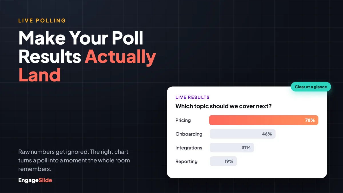
You built the poll, the audience voted, and then the moment fizzled. The numbers went up on screen and… nothing. No gasp, no laugh, no "huh, I didn't expect that." The problem usually isn't the question — it's the picture. A live poll only pays off when people can read the result in a single glance, feel what it means, and remember it after the slide changes. That's what visualizing poll results is really about: turning a column of raw votes into a moment that lands.
This guide walks through how to visualize poll results so they actually communicate — which chart to use, the design rules that make a result readable from the back of the room, and how to reveal it live so the data becomes the highlight of your session rather than a footnote.
Why the visualization matters as much as the question
Humans process images far faster than text or numbers. A well-shaped chart is understood pre-consciously — you see the tall bar before you've read a single label. A cluttered one forces the brain to work, and a working brain is a disengaging brain. When you're presenting live, you have about two seconds to make a result obvious before attention drifts back to phones. Good data visualization buys you those two seconds; bad visualization spends them.
This is also why the same poll can succeed or flop depending purely on presentation. If you're just getting started with live polls, our beginner's guide to live polling covers the setup — this article picks up where that leaves off, at the part everyone skips: making the results readable.
Pick the right chart for the question
The most common visualization mistake is defaulting to one chart type for everything. Match the shape of the data to the shape of the question:
- Bar chart — the workhorse. For "pick one" multiple-choice polls, a horizontal bar chart sorted largest-to-smallest is almost always the clearest option. The eye lands on the winner instantly.
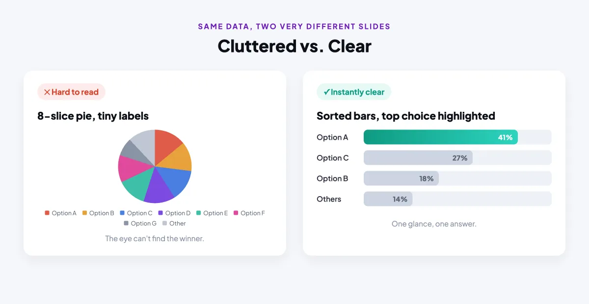
- Donut or pie — parts of a whole, sparingly. Only when you have three or four options and the story is "what share of the room chose each." More than five slices and it becomes unreadable.
- Word cloud — open-ended sentiment. When you ask people to type a word, a live word cloud shows the dominant themes by size. Perfect for mood checks and one-word reactions.
- Ranking bars — order of preference. When the question is "put these in order," a ranking visualization shows the collective priority, not just the top pick.
- Scale meter — intensity. For confidence, agreement, or satisfaction on a 1–5 scale, an average with a distribution shows both the middle and the spread.
The rule of thumb: if someone glancing for one second can't tell you the headline, you've picked the wrong chart. Here's the same poll shown two ways — one that fights the viewer, and one that works with them.
Seven rules that make results land
Once you've picked the chart, a handful of design choices separate a result people feel from one they ignore:
- Sort by value. Order bars largest to smallest so the winner sits at the top. Never leave them in random entry order.
- Highlight one thing. Give the leading option a bold color and mute the rest to grey. Colour is a spotlight — use it to point.
- Limit the options. Five choices is plenty for a live poll. Beyond that, the chart turns into wallpaper.
- Go big on type. The percentage and the winning label should be readable from the back row. If you're squinting on your laptop, the room can't see it at all.
- Show the count. Pair the percentage with the raw vote count so the result feels real, not abstract.
- Give colour meaning. Don't use eight rainbow colours for eight neutral options — that implies a difference that isn't there. Reserve colour for the story.
- One idea per slide. Resist cramming two questions onto one results screen. Each poll gets its own moment.
A great results slide answers one question in one second. If your audience has to study it, the visualization has already failed.
How EngageSlide visualizes results for you
The good news is you don't have to build any of this by hand. In EngageSlide's interactive presentation tool, every poll renders its results as a clean, projector-ready chart automatically. Multiple-choice polls become sorted bar charts that update in real time as votes arrive; open-ended questions flow into a live word cloud; ranking and scale questions get their own purpose-built visualizations. You choose the question type, and the right chart follows.
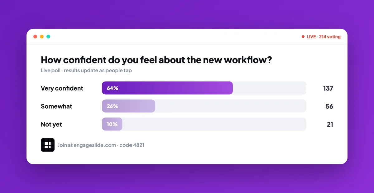
You also get real control over the look. EngageSlide lets you set custom colours for polls, quizzes, ranking and scale questions, so results match your brand instead of a default palette — and so you can use colour deliberately to highlight the point. Because results update live, the chart animates as people vote, which is a large part of what makes the reveal feel exciting rather than static.
Turn the chart into a moment
Visualization isn't only design — it's timing. A few live-facilitation habits make the same chart land harder:
- Reveal, don't pre-show. Keep results hidden until voting closes, then bring them up all at once. Anticipation is half the payoff.
- Narrate the winner out loud. Say what the chart shows — "Pricing ran away with it" — so the visual and your voice reinforce each other.
- React to the surprise. If a minority option did unexpectedly well, point at it. The unexpected result is the most memorable one.
- Compare to a prediction. Ask the room to guess before you reveal. The gap between guess and reality is where the "aha" lives.
Common mistakes to avoid
A few habits quietly kill otherwise good results: leaving a poll open too long so the chart keeps shifting and no one commits to reading it; using a pie chart for eight options; putting the results on a busy background that competes with the bars; and — the most common of all — moving on before the audience has actually absorbed the picture. Give a strong result three or four seconds of silence. Let it breathe.
If you want a broader take on how a clear results view compares across tools, our look at who really lets participants see results better digs into the audience-side experience specifically. And when you're ready to build your own, start simple: one question, one bar chart, sorted, with the winner highlighted. Nail that and every poll after it will land a little harder. You can browse more practical playbooks any time on the EngageSlide blog.